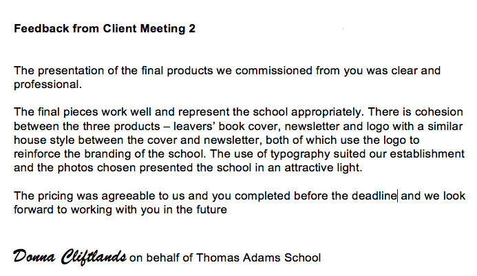
The second product that i created was a book jacket. the purpose of this would be to make the cover of the prospectus more eye catching and therefore mean that more people would be happier to pick up the prospectus and read what it contained. the book jacket itself was aimed at new students of the sixth form and the school. i feel like i have made it fitting to the target audience due to the way in which the images of the school and sixth form and the comments from students makes the school look. compared to the existing book jacket for the school, the one that i made is more graphic. meaning that it isn't boring to the eye due to it being just blue with the school logo in the bottom left hand corner. from my feedback i got told that they thought that my book jacket looked more professional compared to the real one, due to the way it fits in with the target audience etc. As well as this someone that give me feedback thought that it would be a good idea to make the pictures with in the product to have people in them, unfortunately no one would be in the pictures due to them not liking their pictures taken, so therefore i couldn't really change this. When speaking to the client it came back that it was too text rich and needed more graphical images, so i therefore took out all the information of the school sixth form and boarding school and added in images instead. If i was to change something about this product i would make the display font more casual due to the target audience,and also make the lighting within the photo's lighter, due to the timings of the pictures and therfore meaning that it would be dark.
The third and final product that I created was a logo. The purpose for this would be to give the school a brand and a way to be recognised and also create an official status in which the school would be known by. the product would hopefully appear on school uniforms and websites to put it all out there. when creating my logo, I decided to base it around the existing logo's that the school currently uses, instead I made it a mix of the two (one for the college one for the school) and used the main prominent features in both existing logos to make it have a wider range of people viewing it therefore meaning that there is a wide target audience for the product. Another way in which that the target audience is made wide, is due to the use of the lions of England on the logo, which means that it is not only has an audience of the school or new students for the school but it makes it a national logo.When getting feedback from people it came back that it was very professional looking and also that there was nothing that they would change about it, due to it being as professional as the existing products. when meeting with the client it became clear that it was too squashed and therefore needed to be stretched to make the shield more proportioned. if I were to change this product, I would make sure that it was at a higher resolution, so that none of it was pixelated in any way.
To make all the products mentioned above i used Photoshop to make it easy to manipulate any images or any texts that were needed within the products. before making these products i had a large understanding of Photoshop due to previous work in other units and from my own personal use. This made it easier to make the products quickly. due to me being familiar with the range of tools provided on this software.