Wednesday, 23 May 2012

Evaluation

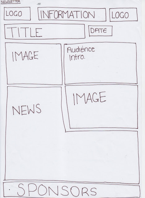
The products that i made were fitting to the purpose because they were informative. Due to me creating products for the school they had to look professional. In order to do this, i used the existing products as a guideline to what was needed to make it professional, for example for the newsletter i created was inspired by an existing newsletter in which was made for a general audience; therefore meaning that they had the same boarders and the same layout at the top of the first page this then adding to the professional look in which i tried to create. The newsletter itself was mainly aimed at parents, but also had another target audience of the students, due to the way in which that the topics for this particular newsletter was written directed to them; the rules and constrictions that were set in place for the year 11 prom. Overall from feedback i got a positive response, the thing that most frequently came up in the feedback was that this product overall looked very professional and therefore fits in with the purpose and target audience that it has. When speaking to the client it came back that the newsletter was too text rich and needed more graphic images in there. With that feedback i changed the text for the Year 11 prom and the year 13 leavers into invites to make it a little bit less text rich, and therefore adding more graphics into it. If i were to change the newsletter in any way i would tone down the formality of the text, due to it having a target audience of the students of the college as well as the parents.

The second product that i created was a book jacket. the purpose of this would be to make the cover of the prospectus more eye catching and therefore mean that more people would be happier to pick up the prospectus and read what it contained. the book jacket itself was aimed at new students of the sixth form and the school. i feel like i have made it fitting to the target audience due to the way in which the images of the school and sixth form and the comments from students makes the school look. compared to the existing book jacket for the school, the one that i made is more graphic. meaning that it isn't boring to the eye due to it being just blue with the school logo in the bottom left hand corner. from my feedback i got told that they thought that my book jacket looked more professional compared to the real one, due to the way it fits in with the target audience etc. As well as this someone that give me feedback thought that it would be a good idea to make the pictures with in the product to have people in them, unfortunately no one would be in the pictures due to them not liking their pictures taken, so therefore i couldn't really change this. When speaking to the client it came back that it was too text rich and needed more graphical images, so i therefore took out all the information of the school sixth form and boarding school and added in images instead. If i was to change something about this product i would make the display font more casual due to the target audience,and also make the lighting within the photo's lighter, due to the timings of the pictures and therfore meaning that it would be dark.

The third and final product that I created was a logo. The purpose for this would be to give the school a brand and a way to be recognised and also create an official status in which the school would be known by. the product would hopefully appear on school uniforms and websites to put it all out there. when creating my logo, I decided to base it around the existing logo's that the school currently uses, instead I made it a mix of the two (one for the college one for the school) and used the main prominent features in both existing logos to make it have a wider range of people viewing it therefore meaning that there is a wide target audience for the product. Another way in which that the target audience is made wide, is due to the use of the lions of England on the logo, which means that it is not only has an audience of the school or new students for the school but it makes it a national logo.When getting feedback from people it came back that it was very professional looking and also that there was nothing that they would change about it, due to it being as professional as the existing products. when meeting with the client it became clear that it was too squashed and therefore needed to be stretched to make the shield more proportioned. if I were to change this product, I would make sure that it was at a higher resolution, so that none of it was pixelated in any way.

To make all the products mentioned above i used Photoshop to make it easy to manipulate any images or any texts that were needed within the products. before making these products i had a large understanding of Photoshop due to previous work in other units and from my own personal use. This made it easier to make the products quickly. due to me being familiar with the range of tools provided on this software.

Feedback

I got feedback on all of my final products, which all came back quite positive.
One of the people that i asked to look at my work, said that they thought it was very professional and that there was nothing that seemed to be an issue. the other person in which i asked what they thought said that they think that the book jacket images need to have more people in it due to the people me asking if they would be in a picture for my work them saying no, therefore meaning i had to improvise in order to get a picture anyway. Their feedback on my logo and my newspaper however was  very positive in the way that he said that he liked them and found no obvious fault.
the other two people that i asked agreed with the previous comments that other people had made, meaning they thought that it was very professional looking and actually looked like something that would be on the school website itself.

Tuesday, 1 May 2012

Client Feedback from first meeting

Budget influence

Photograthy 

£190 
Photos taken on location 
hire photograther for 2 hours 
company Devmac photograthy 

Newsletter Printing 

£58.20
1,000 copies 
4 colors 
A4 
No fold 
Silk paper 
no printing on back 
Company - Mixam print

Graphic designer 

Lucien Howlett
20 years experience 
Fee will have to be dicussed in the enitial meeting.
Max price willing to pay £1,000


Book Jacket


£204
750 copies
company : print print

Thursday, 19 April 2012

This is the first draft which are hand-drawn of the products i am going to create:-


 BookJacket draft


Newsletter Draft


Logo draft


This is the computer draft ups of the products i will be creating:-


Newsletter.

Logo


BookJacket


Tuesday, 10 April 2012

magazine


The advert is placed in Glamour magazine in 2011 which has a large range of audience. even though the main readers of glamour magazines are normally teenagers the median readers age for this particular magazine is 33years old. The advert is spread over 3 pages, which is A4 size and portrait. On the second page of the advert the sample part of the page folds out, meaning that the reader could fold back the page to smell and then to stop smelling could then just simply fold the flap back over to make it the original size.
The mise-en-scene of this text is not very limited. the model has one hand on an apple with a bite missing out of it. the model has a natural palette of make-up on which helps the reader see how much of a natural perfume it is. there is use of shadowing with a pale black underneath her eyes which directs the readers eyes down towards the perfume bottle.
The model is given a seductive look which means that when the reader see's the advert it will make them believe that they will look that good or feel as good as the model looks if they buy and use the perfume. the use of ambient lighting in the background of the image makes the model look as if she's glowing, giving her a sort of frame around her which makes her stand out.
The perfume bottle is packaged like an apple which fits in with the image due to the way in which there is what looks like a bucket full of apples along the bottom of the advert. the golden colour scheme which is followed throughout the text connotes royalty and richness, this creating the illusion that whoever wears this product feels rich and powerful. the golden look of the perfume makes the viewer some what surprised as to how much the perfume really costs. The official status given to the perfume through the brand name 'DKNY' suggests that it would be expensive, due to the designer reputation that the brand holds. The name of the perfume 'golden delicious' refers to not only the smell of the perfume but the apples in the image that the perfume is standing on. the two main focuses of the images is the model which is taken as a medium shot and the close-up of the apples with the perfume bottle in the centre. this showing the audience what is important in this advert.

Recycling.


There is one clear purpose for this pamphlet, this being recycling. The use of a pamphlet in which put on bins for the community to see means that they are promoting the use of recycling boxes.It is obvious as to what the target audience is by looking at the product. It clearly has a large range of people as its audience in both genders, and all ages, even though it is more targeted for adults. The use of the Shropshire council logo tells the viewer of this product that it is for people within the Shropshire area.
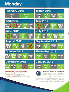
There is lots of use of headings throughout, making it easier for the viewer to navigate the product quickly and efficiently. the headings are in bold and a different colour to the main text making them stand out. The font is clear and easy to read, and also looks more formal than some texts may look with another font. this is reinforcing that the council has some power due to the formality of the text. there are lots of images dotted around the product, which relates to the sorts of things spoken about on the text. the images of empty bottles clearly shows the viewer that they can be recycled and that there is relevance to why it is on this text. The use of the recycling logo reinforces the fact that it is important to recycle, due to the official status that the logo holds. Not only is there that logo, but the use of the councils logo adds more official status to the text, as it is deemed as important. the use of tables makes it more graphical for the viewer so that its not just block texts that is hard to skim through. the table is used to show when the bins go out, which is done in 2 main colours to make the audience be drawn straight to it. the use of a photo of a man on the front with a box of recycling stears the target audience towards males, even though it is for mixed genders.there is a lot of use of graphology throughout this text which means that there is a range of things for the viewer to look out, therefore meaning that the text isn't as daunting as it could be due to its use of a cold colour palette. the use of white space also creates the illusion that there isn't much to read on the product due to the way in which the text looks like it is in a small quantity. there are alot of bullet points on the text which means that it is easy to navigate.

Wednesday, 21 March 2012

digipak analysis


The digipak shown in the picture above only has two panes to it, the CD is kept in place by plastic, and the digipak includes a lyric book with all the song son the discs full lyrics. The main colours on the digipak is brown, this seems as if it is due to the way that there is an image on the front of the digipak of a slab of wood which has a slight heart shape cut out with an image within the hole, this then has the border effect, there is also a suggestion that there is a smoky tone to the image, this links in with the name of the album; 'Smoke of home'. From the look of the image within the digipak it looks like it is photographically used with illustrated border over the top. 

The typography is done in the way to make it look like it is handwritten, this makes the audience feel like it is more of a homely thing. This links in with the album title 'smoke of home' this therefore suggests that there is a typography, graphology and representations linked in one way or another. The text is a browny colour, which links in with the colour scheme. The first letter of the band name and the 's' on the word 'smoke' in the album name are both uppercase, apart from that they are all lowercase, which suggests a calm and more tranquil album, which could contain a band that has ballads with in it. On the back of the digipak you can see that there are numbers used for the song list, as well as this the numbers that are on the far right hand side next to the song names are the length of the songs. The use of astrics around the album title suggests that there would be a high sense of sophistication. 

The digipak i would think would be aimed at a different range of people, this being due to the music taste of the people. In my opinion the digipak doesn't really tell me what the target audience is, but i can only assume that this is due to the way in which they are already known, and therefore already have their own fan base so it doesn't matter how technical the digipak is. By looking at the digipak i would think that the promises given out from the look of it would be that it would be quite tranquil meaning a high use of ballads; this could have an effect on who buys the album due to their songs being slow and more like ballads than anything else. 


Tuesday, 20 March 2012

'The Corpse Bride' poster analysis


   These posters are called a teaser poster and a theatrical poster, as you can see the teaser doesn't give out any information such as the credit block, therefore it just to advertise the film whereas the theatrical poster does. The purpose of this poster is to make the audience of Tim Burton's films aware of the new film that he is releasing.

   The poster is a standard sized and portrait, the main colours used within the posters is blacks and blue, giving it a cold feeling which ties in with the film itself, due to the way that there is corpses involved. The film is an animation which follows the quirky style of Tim Burton, the main image in the background is a full moon which has a dark and quirky style that shows through. the main figures are the two main characters within the film. Victor van-dort the main character on the left has the facial expression of being shocked, due to the way if you watch the film you know what has been happening, he never expected to be marrying the corpse bride (right), where as the corpse bride has a smile on her face as he has been waiting for the day to be married ever since she was murdered. Victor is very skinny which suggests that he is just bone, this is contradictory due to the way that he is just as skinny as the decaying body of the corpse bride. Between the two main characters there is the dog that was victors when he was a child, and therefore it suggests that there are many different aspects that suggest that there are more than one type of target audience. the aspect of having an animal in the film even though it is a dead one makes it more of a family/children film, due to the way the deceased are not shown as the typical zombies, they are portrayed as normal people. On the side of the poster there is what looks like two trees which makes it seem as though they are walking into the forest,as well as this it makes the audience feel as if they are within the film therefore attracting more people to watch it.

   The text within the posters is quite cursive which adds to the effect of the quirky style within the film, the size of the title is quite small compared to how it could be, but it is situated in between the two trees that are at either side of the poster, it is also in white which stands out against the dark colour palette in the image, It is the same for all the text apart from the credit block which it done with a more sans-serif font, as it is the more important part of the poster and therefore is seen more important due to the professional look of the font. The tagline for the film is 'there's been a grave misunderstanding' which links into the film and therefore makes the audience feel like they are being targeted, the tagline is also a play on words (pun) and therefore makes it more interesting for the audience to look at. The use of upper-case is in the bit where it says about when it is release 'RISING TO THE OCCASION THIS SEPTEMBER' this makes the audience therefore notice it quicker meaning that they can see it at a quick glance, the other use of upper case is at the start of each word in the title. Throughout the posters there is a strong sense of messages portrayed, both visual and verbal in the way in which the images shows victor and the corpse bride holding hands like the normal married couple would do, the sense that it is with a corpse and a living man makes it more of a mystery as to how this came about. the verbal side of the messages is put through the way in which the slogan says that there has been a grave misunderstanding, referring to the fact that the misunderstanding is the fact that victor didn't mean to marry the corpse and then the link between the corpse by the use of a pun in the bit where it says 'grave'. I think that the target audience would be a family audience, due to the way that it is an animation and therefore it has a child target within it. The way in which there is a dog in the middle of them also suggests that it is aimed at families.

   The generic conventions shown within the posters shows that it is a fantasy animation. This is through the way in which in day to day life you do not see a corpse and a man married walking down the street this therefore making it a fantasy. tim burton the director adds in another aspect to the fantasy in the way he adds a dark and quirky style into the films that he creates, therefore making it easier to distinguish his films from another at a quick glance of the posters or trailers. In pretty much all of Burton's films stars Johnny Depp and therefore he is being used as a unique selling point due to the way in which burton has his own fan base which could sometimes be due to the way in which he brings Johnny Depp's fan base into his fan base therefore making his a lot bigger than it would be if he constantly used different actors as the main role in every film. Unlike most posters there is no use of critic reviews on the poster, this may be due to the way in which Tim Burton has such a big name for himself that he can advertise without due to the fact that people know what to expect. The tag line is used very effectively due to the way in which it is a pun, therefore making people read it and think that they have to watch it, as it is linked very cleverly to the film itself with the use of a grave referring to the corpse bride. the poster gets attention due to the way that there is a walking corpse that isn't scary, and therefore goes against any stereotype that horror films seem to portray about 'the living dead', due to the fact that you never normally see a nice 'zombie', this therefore will shock the audience and therefore make them quite sceptical of the idea that this could be reality therefore backing up the genre being fantasy. the persuasive techniques within the posters are quite clear, due to the way in which the names of the actors are in bold above who they are the voices for within the film, therefore the actors are being used to persuade people to watch the film due to the way that they are well known and therefore people know what to expect. as well as this there is the use of the directors name above the title saying that its his film 'Tim burtons corpse bride' therefore the viewer of this poster can see that it is his film and no-one else's. from the poster the audience are promised a shocking and fun viewing of the film, due to the way that they say that it was a grave misunderstanding therefore making the audience feel that there is a strong sense of shock in the way in which there is reference to death and then the fun is promised in the way in which that they have a picture of a dog, which if any child looking at the poster would automatically think that it would be fun in the way in which if they have their own dog they know how much fun they could have when taking their dogs for a walk etc, it is therefore making the audience think about daily life.

   At the bottom of this poster there is the Warner Bros. logo which shows that they are the production company in which Tim Burton used. as well as this there is the rating 'PG' which according to the BBFC have a few scenes within the film the children are advised not to watch on their own, this means that there could be a high sense of something bad in which the guidelines state they mustn't watch with out supervision. the information within this poster could be seen as important due to the way in which when looking at the poster you can see what rating the film is so you know whether you should go and watch it and also knowing what production company was used you would know if they have a good reputation of making films that are worthwhile watching. the poster would of been placed in the cinema, and therefore when people would be waiting for their films they would read the posters or at least look at them in order to pas the time, and therefore building a higher range of people watching the film therefore making more money, as well as this it could be placed in certain types of magazines therefore making money when people pay for the magazine. It plays a small part of the marketing campaign as the trailer and any other sources of advertisements like radio etc.

   In my opinion I think that the poster is good, my reasoning's for this is due to the way the audience can connect to the imagery within it. I think it is effective to the targeting audience due to the way in which the audience can relate to the animal side of things,as well as this I think that the posters are effective due to the way in which  the genre is conveyed, through the colours, and the make believe aspects that make it believable to look at the poster and see that it is within the fantasy animation genre.In my opinion I do not think that the film poster is offensive in any way, I think that some people may find the fact that there is a corpse on there to be offensive, but I genuinely don't see a problem with it therefore meaning that I overall believe that this is a good poster.