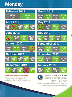
There is lots of use of headings throughout, making it easier for the viewer to navigate the product quickly and efficiently. the headings are in bold and a different colour to the main text making them stand out. The font is clear and easy to read, and also looks more formal than some texts may look with another font. this is reinforcing that the council has some power due to the formality of the text. there are lots of images dotted around the product, which relates to the sorts of things spoken about on the text. the images of empty bottles clearly shows the viewer that they can be recycled and that there is relevance to why it is on this text. The use of the recycling logo reinforces the fact that it is important to recycle, due to the official status that the logo holds. Not only is there that logo, but the use of the councils logo adds more official status to the text, as it is deemed as important. the use of tables makes it more graphical for the viewer so that its not just block texts that is hard to skim through. the table is used to show when the bins go out, which is done in 2 main colours to make the audience be drawn straight to it. the use of a photo of a man on the front with a box of recycling stears the target audience towards males, even though it is for mixed genders.there is a lot of use of graphology throughout this text which means that there is a range of things for the viewer to look out, therefore meaning that the text isn't as daunting as it could be due to its use of a cold colour palette. the use of white space also creates the illusion that there isn't much to read on the product due to the way in which the text looks like it is in a small quantity. there are alot of bullet points on the text which means that it is easy to navigate.
Tuesday, 10 April 2012
Recycling.
There is lots of use of headings throughout, making it easier for the viewer to navigate the product quickly and efficiently. the headings are in bold and a different colour to the main text making them stand out. The font is clear and easy to read, and also looks more formal than some texts may look with another font. this is reinforcing that the council has some power due to the formality of the text. there are lots of images dotted around the product, which relates to the sorts of things spoken about on the text. the images of empty bottles clearly shows the viewer that they can be recycled and that there is relevance to why it is on this text. The use of the recycling logo reinforces the fact that it is important to recycle, due to the official status that the logo holds. Not only is there that logo, but the use of the councils logo adds more official status to the text, as it is deemed as important. the use of tables makes it more graphical for the viewer so that its not just block texts that is hard to skim through. the table is used to show when the bins go out, which is done in 2 main colours to make the audience be drawn straight to it. the use of a photo of a man on the front with a box of recycling stears the target audience towards males, even though it is for mixed genders.there is a lot of use of graphology throughout this text which means that there is a range of things for the viewer to look out, therefore meaning that the text isn't as daunting as it could be due to its use of a cold colour palette. the use of white space also creates the illusion that there isn't much to read on the product due to the way in which the text looks like it is in a small quantity. there are alot of bullet points on the text which means that it is easy to navigate.
Subscribe to:
Post Comments (Atom)


No comments:
Post a Comment